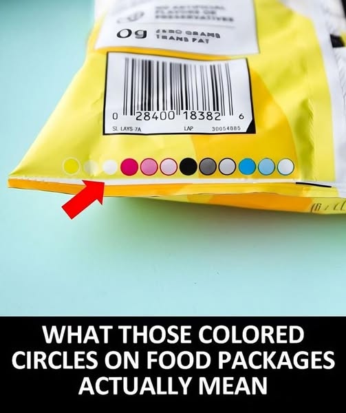
Ever really look at a snack wrapper or chip bag? Besides guilt – inducing nutrition facts and serving sizes, there’s often a heart – warming brand – history story. But under all that, below the copyright and barcode, there might be a colorful mystery.
The packaging design can be full of hidden meanings. Colors, fonts, and images carry subtle nods to the brand’s history or values. Also, the sourcing and production of these snacks can be interesting. Where do the ingredients come from? What sustainable practices are used?
Those rainbow circles on the package? They won’t get you a lifetime of snacks. But they do have a purpose, more related to packaging and graphic design than nutrition, freshness, or taste.
These colorful circles, called “process control patches” or “printer’s color blocks,” check if the packaging colors are accurate. They test how a set of “process colors” look and are like a design checklist before shipping.
Usually, you’ll see black, magenta, cyan, and yellow circles. They can create many colors, like in a home color printer. But some packages use brand – specific colors. For example, a Cheetos bag has a special orange. Then, you might see non – primary color circles that match the brand’s shade.